
The arrow escapes the box: a visual metaphor for this accounting firm that specializes in bankruptcy, litigation and business advisory services.
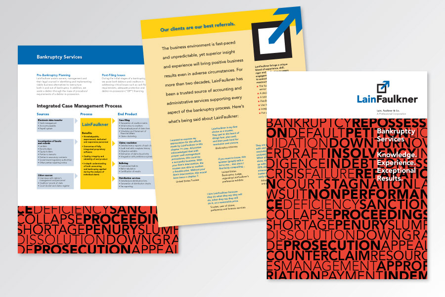
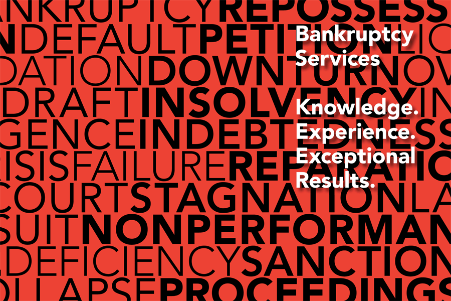
Working with The TransSynergy Group, FigDesign produced a corporate brochure explaining their value proposition with concise diagrams. Strong use of red, the “no-no” color for accountants, helps communicate what the company delivers for clients. As the pages are turned, the “red ink” area at the bottom of the page — filled with negative business terms like insolvency and stagnation — gradually decreases in size until it ebbs away.