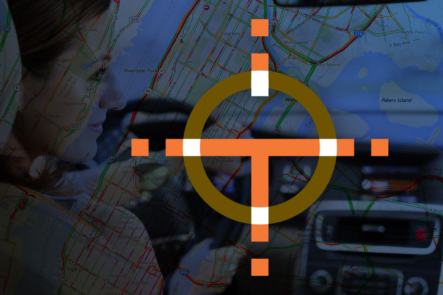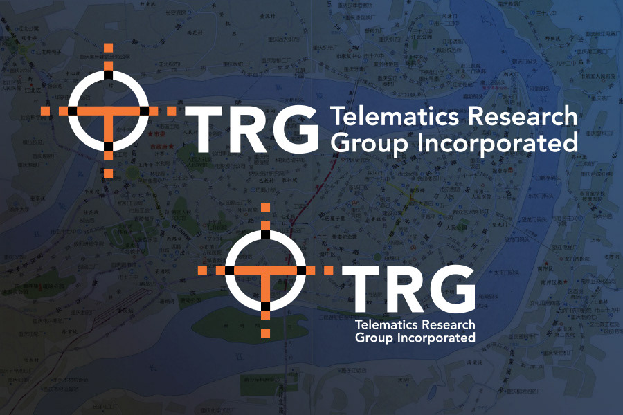

This international company researches the markets of automotive communication and information technology. Navigation, accident avoidance, mapping and traffic reporting continue to be major areas of development.
For the logo and identity, FigDesign combined mapping symbols with a T shape for a distinctive mark, positioning the company as a premier ‘wayfinder’ among competing research firms.
Additional applications include web site design, corporate stationery, and other branding materials.